Photo Assignment 4: Rule-of-Thirds
- Ruby Moley
- Sep 28, 2025
- 2 min read

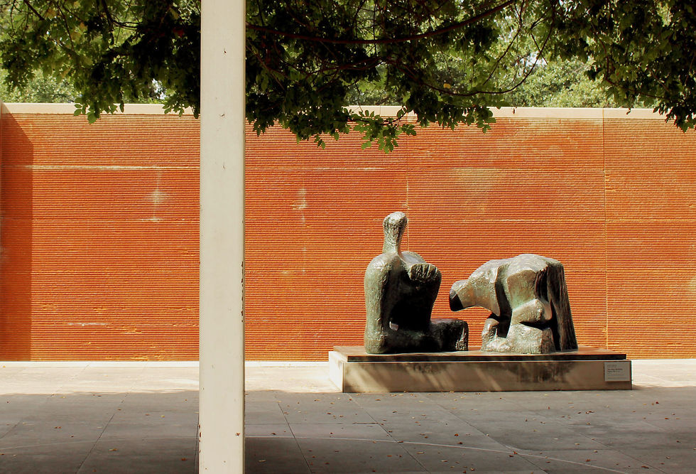
As part of my journey around Downtown Dallas, I stopped by the Dallas Museum of Art. Behind the museum, there’s a peaceful outdoor courtyard filled with sculptures and waterfalls. The space is surrounded by beautiful natural light, creating striking geometric shadows that complement the artwork. I especially love the rusty orange rock walls — even without the water flowing, they bring a vibrant pop of color and warmth to the scene. The combination of art, architecture, and nature makes the courtyard feel both serene and visually dynamic, making it a perfect spot for creative photography.
What I did right: After cropping and straightening, this photo follows the rule of thirds nicely. The statue falls at the intersection of two of the grid lines, the pole aligns with a vertical line, and the horizon sits just below the center point. I think the contrast between the bright light and the shaded foreground naturally guides the viewer’s eye toward the statue and creates a stronger sense of depth. The clean, geometric architecture provides a structured backdrop that makes the organic forms of the statue stand out beautifully. I also really enjoy the warmth of the overall scene and its minimalist quality, which keeps the focus clear and uncluttered. Overall, this composition feels intentional and balanced, and it successfully highlights both the sculpture and its environment.
What I did wrong: The pole could be seen as a little distracting, therefore I could’ve shot this from closer up or from a different angle. The midday light is a little harsh on the subject, with the difference in exposure from the shade versus the direct light posing a challenge. I also could’ve stepped back to add more variation in the environment, as I tend to zoom in more than I imagine. I also wish I would’ve changed up the aperture more to gain some blur in the background or foreground.
How I fixed this: When I was taking this picture, I moved side to side to experiment with different angles. The “pole” in the final image is actually part of a rusty metal gate that’s used to close off the garden when the museum is closed. I deliberately repositioned myself multiple times to create the illusion of a single pole rather than showing the entire gate, which felt distracting. I also adjusted my shutter speed and aperture to get the exposure just right for the lighting conditions. To keep my composition balanced, I turned on the grid feature on my camera so I could follow the rule of thirds as I shot, which definitely helped me frame the scene more thoughtfully.
I love the art and architecture of the DMA. It’s always such a fun and inspiring place to take photos. The space is full of color, creativity, and unique design elements that make it easy to experiment with different compositions. I believe my work here reflects my growing photography skills and captures the vibrant, artistic spirit of the museum in a way that feels personal and intentional.


Comments