Architectural Sketches: A process
- Ruby Moley
- Nov 20, 2024
- 2 min read

Updated: Nov 25, 2024
Published on 11 / 20 / 2024
For this blog piece, I wanted to highlight the process I underwent to create my sketches for my Legacy Project. I designed a Movie theater, creating architectural designs for the exterior facades and interior blueprints. They were all done by hand, with Pigma Micron Fineliner pens, Chiseled alcohol markers, and smooth Bristol artist paper.
I began the initial drawings by sketching with Staedtler drawing pencils. These are my favorite pencils for drawing with their different shades and pressure options. I roughly and lightly drew the designs, going back over them with the fine pens when I was content with the layout. All straight lines were drawn with a ruler, a good rule of thumb for architecture drawings I learned in high school. No matter how small, use a ruler! It adds so much to the finished project.
For perspective drawings, I focused all the lines into two separate perspective points on the horizon line. This is called "Two Point Perspective," a technique for creating consistency in a 3-dimensional design.

After all the pen lines are drawn, I erased the pencil sketches and it is time to color!
I used a scratch paper sheet to test each color before it made it onto the official papers. Think of this process like a painter's palette, a space for error and color mixing. Even in other mediums besides paint, this process is very helpful!

Coloring in the drawings was so fun! I used my knowledge of color theory and my gut to creatively fill in the design. I used reference photos for the color palettes of each one and various techniques of drawing. For shadows, I either used select markers that were shades darker or layered inks (these markers are great at this). I used pointillism for things like the trees and other exterior landscaping. I had to color quickly when filling out large areas of color, as alcohol markers blend best when freshly placed on the paper. Therefore, the quicker the ink merges, the less likely it'll leave coloring lines. In the end, here are my drawings!


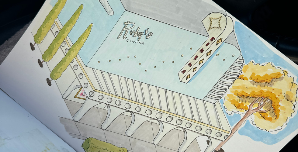


Something I problem-solved with was the tiles. I had never drawn colored tiles before, and I wanted to accentuate the dimension and reflective properties of the texture. I used some of these photos as a reference to create them.


Additionally, I noticed these sketches used a white pen to add highlights. I realized I had a white Posca pen at hand, and took it to some of the drawings, like with the clouds or any reflective surface. This was a great addition to add a sense of realism to the piece.
In summary, all the skills I used in this were from the 21st Century Design Academy, art classes, TSA (a high school technology competition program), and my personal practice of art. I think the project came out beautifully. If I were to change anything, I would add more pen detail to some of the drawings


Comments